

Overview
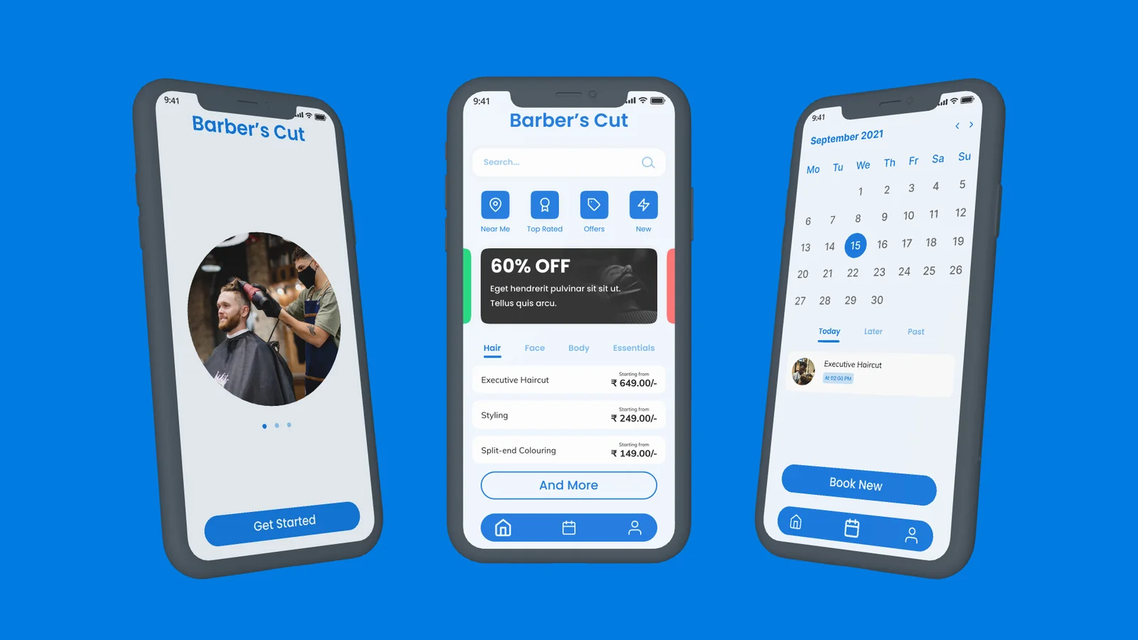
Barber's Cut is a mobile appointment-scheduling application where local salon owners list their services and rates, and customers can browse verified reviews, book an in-shop slot or a home-visit service, and clarify service questions over chat before confirming. Completed end to end in a 12-hour design sprint.
The problem
Problem statement: Design a frictionless appointment-scheduling app for barbershops and salons in a local neighbourhood.
Problem discovery
As work-from-home became the norm, people lost patience for sitting in crowded barbershop waiting rooms. What used to be a social waiting-room ritual turned into dead time spent staring at a phone — while shop owners struggled to manage peak-hour walk-in crowds and idle off-peak chairs.
Solution & perks
Barber's Cut bridges both sides of the chair while focusing this case study on the end-user booking experience:
- Zero waiting-room guesswork: Browse services, transparent pricing, and open time slots before leaving home.
- Safety & trust: Check verified reviews, hygiene instructions, or opt for a home-visit service.
- Predictable shop operations: Salon owners can see their day's schedule in advance and prepare the right specialist and equipment.
Users & value proposition
Because haircuts and grooming span every age group, I anchored the research around two primary customer personas — Students and Working Professionals — supported by empathy mapping and customer journey mapping to trace their frustrations with walk-in queues.
| Side | Value delivered |
|---|---|
| Customer values | 1. Simple, flexible appointment scheduling 2. Upfront exploration of services and rates before visiting 3. In-app chat for service-related queries 4. Verified reviews to avoid bad experiences 5. Flexible payment options |
| Business values | 1. Calendar view of daily and upcoming appointments 2. Portfolio space for stylists to showcase their skills 3. Upsell mechanics via offers, combos, and recommendations |
User flow & information architecture
I mapped the primary booking path from mobile OTP login straight to slot confirmation, then structured the app's information architecture so users can enter discovery through whichever lens they already have in mind: By Salon, By Service, or By Stylist.
Wireframes & visual system
To move fast within the 12-hour clock, I laid out the 12-screen low-fidelity wireframe flow in Figma first, then layered a clean visual system informed by UI patterns from Dribbble and Mobbin, Feather icons, and photography from Unsplash.
Try the prototype
Click through the interactive Barber's Cut booking flow in the embedded Figma prototype below, or open it full screen.
Scaling Barber's Cut — the multi-specialist cart
The challenge: What happens when a customer wants services across different salons, or multiple services in the same salon handled by different specialists?
The solution: The next phase of Barber's Cut treats bookings like an Amazon-style cart. Instead of locking a checkout to a single stylist or shop, customers can add services from multiple specialists (or across different neighbourhood salons) into a single itinerary and check out in one go.
Key learnings
- Research sharpens speed. Even a lightweight persona, empathy map, and IA pass eliminated guesswork once high-fidelity UI began.
- Timeboxing forces clarity. Setting a strict 12-hour clock from problem framing to high-fidelity prototype forced decisive layout choices and noticeably improved my design speed in Figma.