

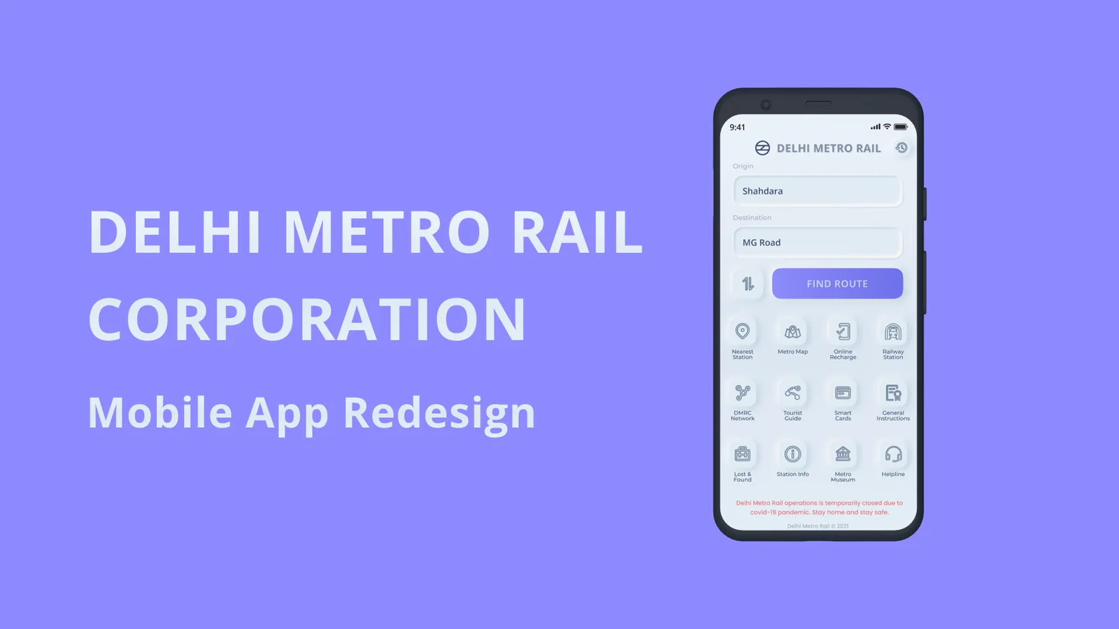
Overview
When I moved from South India to North India and set out to explore Delhi with friends, everyone gave me the same advice: take the Metro. On a cold winter morning I downloaded the official Delhi Metro Rail Corporation (DMRC) app to look up the map and plan our route. The underlying network was world-class; the app experience wasn't. Around the same time I had started using CRED and was fascinated by tactile, neumorphic interfaces — so I took the DMRC app on as a self-initiated redesign to fix the usability gaps I'd hit first-hand.
Note: Because this was an independent redesign without access to DMRC's internal telemetry or operational constraints, it is scoped as a focused UX/UI exploration built around commuter pain points and public Play Store feedback.
Goals & motivation
Product goals:
- Deliver an intuitive, uncluttered route-planning experience for both daily commuters and first-time visitors.
- Make common commuter actions — swapping stations, re-running recent searches, comparing faster routes, and checking platform info — immediate.
Personal goals:
- Own the full product design loop end to end: app audit, Play Store review synthesis, problem definition, UI redesign, and interactive prototyping in Figma.
- Test how far a tactile visual language could go while keeping transit information legible for commuters of all ages.
App audit & user research
"Users are not always logical, at least not on the surface. To be a great designer you need to look a little deeper into how people think and act." — Paul Boag
Because I was already a user of the app, I began with a heuristic walkthrough of the existing information architecture and navigation flows, then cross-checked my notes against Google Play Store reviews from daily Delhi Metro riders and tourists.
The problem — five pain points
Synthesising my own audit with commuter reviews surfaced five recurring failures:
- No way to swap origin and destination. Planning a return trip meant re-entering both stations from scratch.
- Cluttered, disorienting home UI. Essential route tools were buried alongside secondary informational links.
- No recent searches. Daily riders had to type the same stations repeatedly.
- No alternative or shorter route suggestions. The app returned a single path without surfacing faster or fewer-interchange options.
- No live platform visibility. Commuters couldn't see live platform indicators when navigating busy interchanges.
Proposed solution — Then vs. Now
I redesigned the core screens in Figma, pairing a cleaner information hierarchy with soft, tactile surfaces and clear visual contrast between primary route actions and secondary utilities.
Prototype & learnings
Key learnings
- Small interaction fixes carry disproportionate weight in transit apps. A single origin/destination swap button and a recent-searches list save more commuter time than any visual polish.
- Every layout decision lands on the user. Auditing real Play Store complaints alongside my own first-time-tourist friction grounded the redesign in problems riders actually hit on the platform.