

Overview
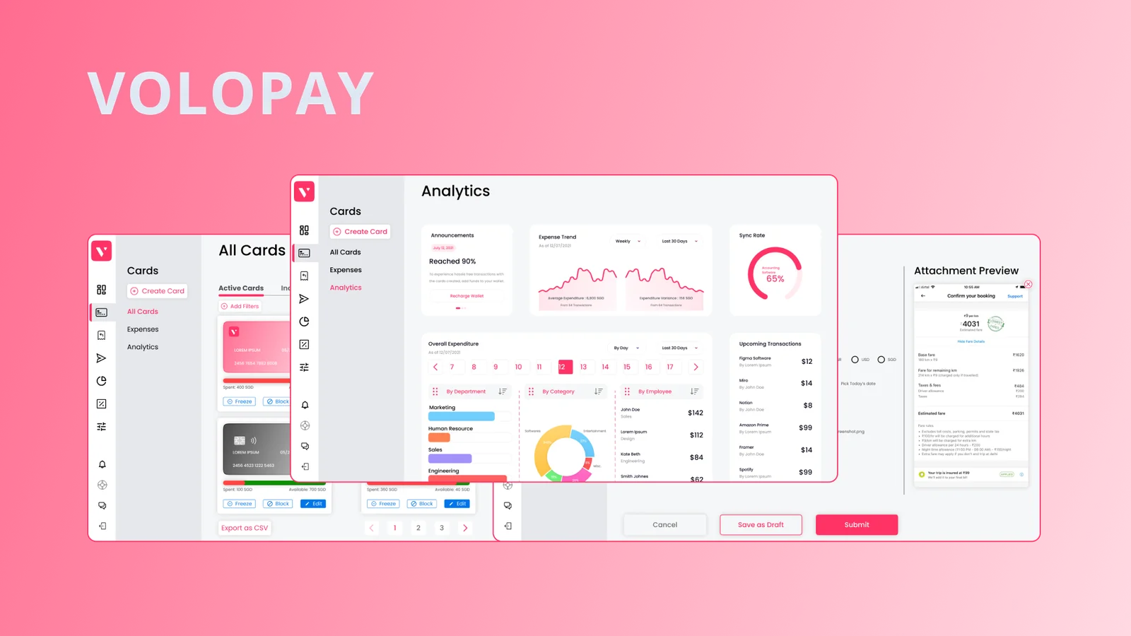
A product design exercise for Volopay tackling two connected halves of corporate spend: how admins issue cards, track spend, and sync expenses into accounting software, and how employees submit out-of-pocket claims and get reimbursed. Designed end to end for web across both the Admin and Member roles.
The brief
The exercise split corporate spend into two product design tasks:
| Task | Goal | Key deliverables |
|---|---|---|
| Task 1 · Corporate cards & spend | Let companies create and issue physical or virtual cards to employees, track and analyse spend, and sync expenses into accounting software after approval. | 1. Expense listing with approval and accounting-sync status 2. Card settings UI to adjust limits and balances 3. Spend analytics dashboard across all issued cards 4. UX/UI flows to code and sync expenses into accounting software |
| Task 1.1 · Out-of-pocket reimbursements | Let employees submit reimbursement claims for out-of-pocket spend and give admins a clear approval and tracking workflow. | 1. Claim creation flow 2. Claim listing for members and admins 3. Admin approval workflow 4. Reimbursement analytics dashboard |
Research & competitive landscape
My primary research focused on how finance teams and managers run card issuance, expense tracking, and reimbursement approvals day to day. For secondary research, I studied Volopay's product articles and demos to understand how their existing platform framed these workflows.
I then benchmarked direct competitors from Volopay's site (Expensify, Wise, Aspire, Xero, Revolut) alongside the broader category on G2's Volopay alternatives list: Divvy, Spendesk, Bento for Business, Ramp, Soldo, Precoro, Airbase, Expensya, Teampay, and Finly. Having previously designed a travel expense management system, I also leaned on TravelBank's claim flow as a reference point for keeping multi-step claim submission lightweight.
Framing the problem
Before sketching screens, I framed the problem around the 3Ws — Who, What, and Why — and made my working assumptions explicit.
- Who: Larger organisations trying to simplify corporate spend, specifically organisational managers, finance teams (admins), and employees (members).
- What: A unified web workflow to issue and govern employee cards (Task 1) and submit, review, and reimburse out-of-pocket claims (Task 1.1).
- Why: Give finance admins and employees a single source of truth to track cards, expenses, approvals, and reimbursements without bouncing between spreadsheets and point tools.
Working assumptions:
- Organizations issue both physical and virtual cards.
- Cards can be assigned to an individual employee, a group, or a department.
- Scoped to the web application where finance admins and employees manage reporting and approvals.
- Expense and claim approvals follow up to a two-level workflow — Approver, Admin, or both.
Process flows & layout system
Both core jobs reduce to a four-step path so neither admins nor members get lost in modal mazes:
- Create & assign a card (Admin):
Login as Admin → Create Card → Add Details → Submit - Raise a reimbursement claim (Member):
Login as Member → Raise Claim → Add Details → Submit
To keep the web app predictable across both roles, I first assembled a design system (primary and secondary palette, typography using Alata and a credit-card display face, and iconography via Iconify matched to Volopay's brand identity) and a standardised layout template before building out the screens.
Design principles
I anchored the interface on five of Nielsen's usability heuristics:
| Principle | How it shows up in the product |
|---|---|
| Visibility of system status | Real-time analytics dashboards for both card spend and claim reimbursements, plus explicit approval and accounting-sync badges on every row. |
| Match between system and the real world | Plain financial language instead of internal accounting jargon. |
| User control and freedom | Clear exit and cancel paths on every creation and approval drawer so users never get trapped mid-flow. |
| Recognition rather than recall | Key filters, card limits, and claim statuses stay visible in context rather than buried behind secondary menus. |
| Flexibility and efficiency of use | Keyboard-friendly shortcuts and quick actions that speed up repeat admin reviews without cluttering the view for first-time members. |
What I designed
Entry point
The home screen lets the user enter the prototype as either an Admin or a Member, branching into the two role-specific workspaces.
Admin workspace · Cards, expenses & claims
Admins can issue physical or virtual cards, inspect active and inactive card inventories, review every card expense alongside its accounting-sync state, and manage employee reimbursement claims and eligibility rules.
Member workspace · My cards, expenses & claims
Members get a focused view of the cards assigned to them, their spent vs. available credit limit, their personal card expenses, a fast flow to raise out-of-pocket reimbursement claims, and a Peer Claims queue when they act as a first-level approver.
Try the prototype
Click through both the Admin and Member flows in the embedded Figma prototype below, or open it full screen.
What I learned
- Dual-role fintech products live or die on shared state. Every card limit, expense row, and claim status has an Admin face and a Member face; designing them on top of one layout template and token system kept the two sides coherent.
- Upfront component discipline compounds. Building the Volopay token and auto-layout system first made iterating across 13 dense financial screens significantly faster.